Rule of Sixteen

The “Rule of Sixteen” is a simple approximation used by option traders to quickly get an idea of the potential move a particular underlying security might make. As a quick example, suppose it’s a day before expiration and you’re trying to determine how concerned you should be about covering a position of out of the money options. The Rule of Sixteen says that with an implied volatility of 32 there is about a 2/3rds chance that the underlying will move 2% or less in that one remaining day. One out of every three days the underlying will move more than 2%.

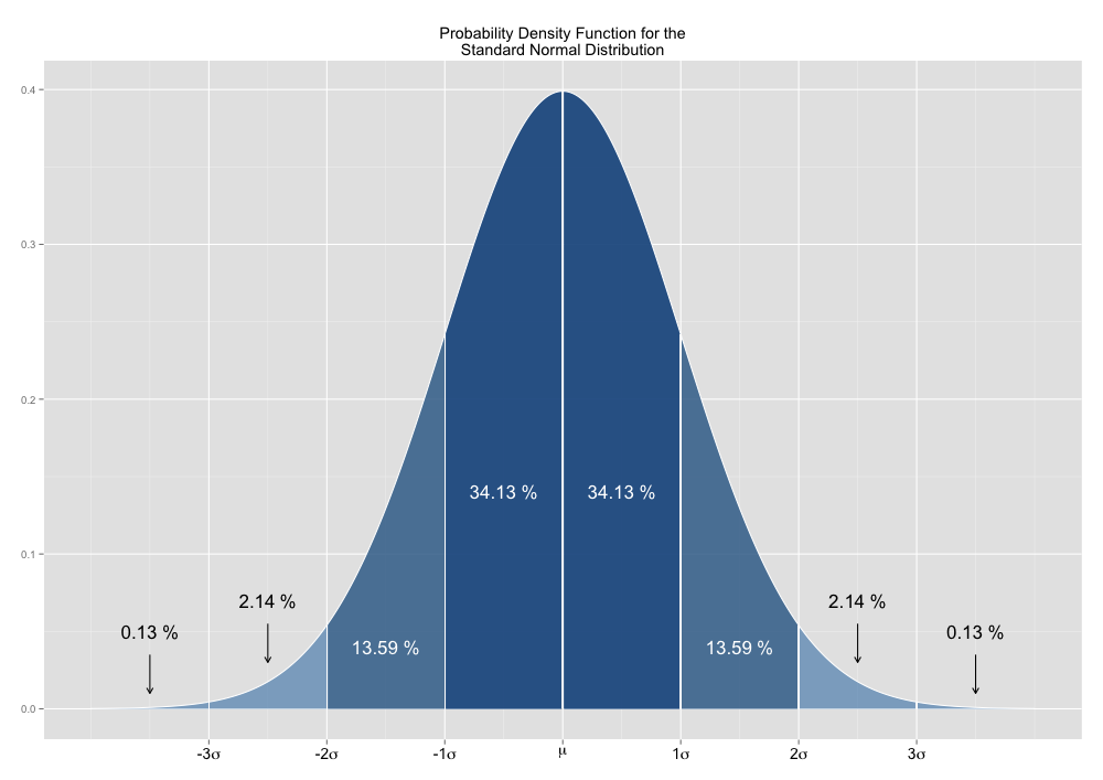
The approximation is easily calculated by dividing the implied volatility by 16. The result is simply the “de-annualized” volatility, or in other words, the standard deviation of the daily normalized price returns. Using this result (the standard deviation) and basic statistics, a trader should then know that there is a 68.27% (approx. 2/3rds) chance that the underlying will move less than one standard deviation, or 2% in this example. There is also a 95.45% chance that the underlying will move less than 4% in this example, or two standard deviations.
Standard Normal Distribution

Interpreting The Rule of Sixteen is just a simple matter of analyzing the standard deviation in the context of the standard normal distribution. However, the reason that this approximation is called The Rule of 16 rather than The Rule of Twelve, or The Rule of Nineteen has to do with the process of “annualizing” the standard deviation.

When calculating the historical volatility of an underlying security the standard deviation of the normalized price returns is multiplied by a ratio to calculate the annualized volatility. This “annualizing” ratio is calculated as the square root of the number of trading days in a year divided by the number of days in the price return. So for a normal year, where there are 252 trading days and the historical price returns have been calculated daily, this annualizing ratio would be the square root of 252 divided by 1, or 15.87. This ratio is sufficiently close to 16 and is the reason that it’s called The Rule of Sixteen.

While The Rule of Sixteen can be a handy tool for quickly approximating the potential range of movement in an underlying security, there is a much larger issue that traders should be aware of beyond just the mathematical simplifications that go into this tool. The interpretation of The Rule of Sixteen is typically based upon the analysis of standard deviation in the context of the normal distribution. This is an assumption that can lead to potentially disastrous results.

When analyzing the distribution of price returns for a particular security it’s not uncommon to discover that the higher moments diverge significantly from that of the standard normal distribution. Often the price returns will exhibit skewness and/or kurtosis well in excess of the standard normal distribution. While skewness can be problematic, significant amounts of excess kurtosis can be absolutely devastating from a risk management standpoint. Ignoring excess kurtosis, and the fat-tails associated with it, can lead to prices range estimates that are significantly understated.

So while The Rule of Sixteen can be a quick and helpful way to estimate a probable range of prices, it’s significant limitations should be well understood before use.
Path Independence of Volatility

Volatility is undoubtably one of the most important aspects of option trading. Although the basic idea of calculating historical volatility as the annualized standard deviation of a series of lognormal close to close price returns is fairly simple, there exist a broad range of adaptations of this general idea in an attempt to glean additional insight and efficiency from market data. Nonetheless, this traditional method of calculating volatility is still in wide use due to the simplicity of its calculation and the intuitive nature of its insights.

While the calculation of historical volatility is often used as a rough estimator for future volatility, this information may give an options trader some idea of the likely size of moves in the underlying, but it doesn’t provide any information about the direction, path, or minimum range of price changes. The limitations of volatility become evident when comparing similar time series that follow very different paths.

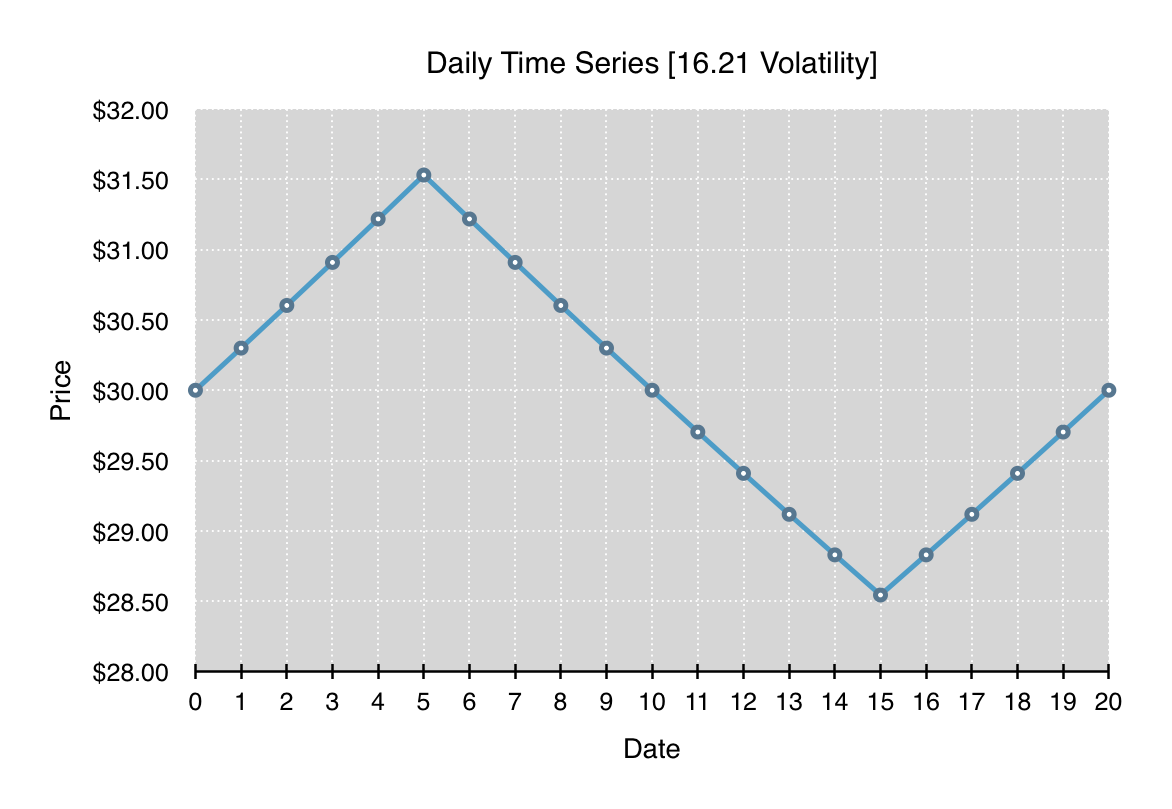
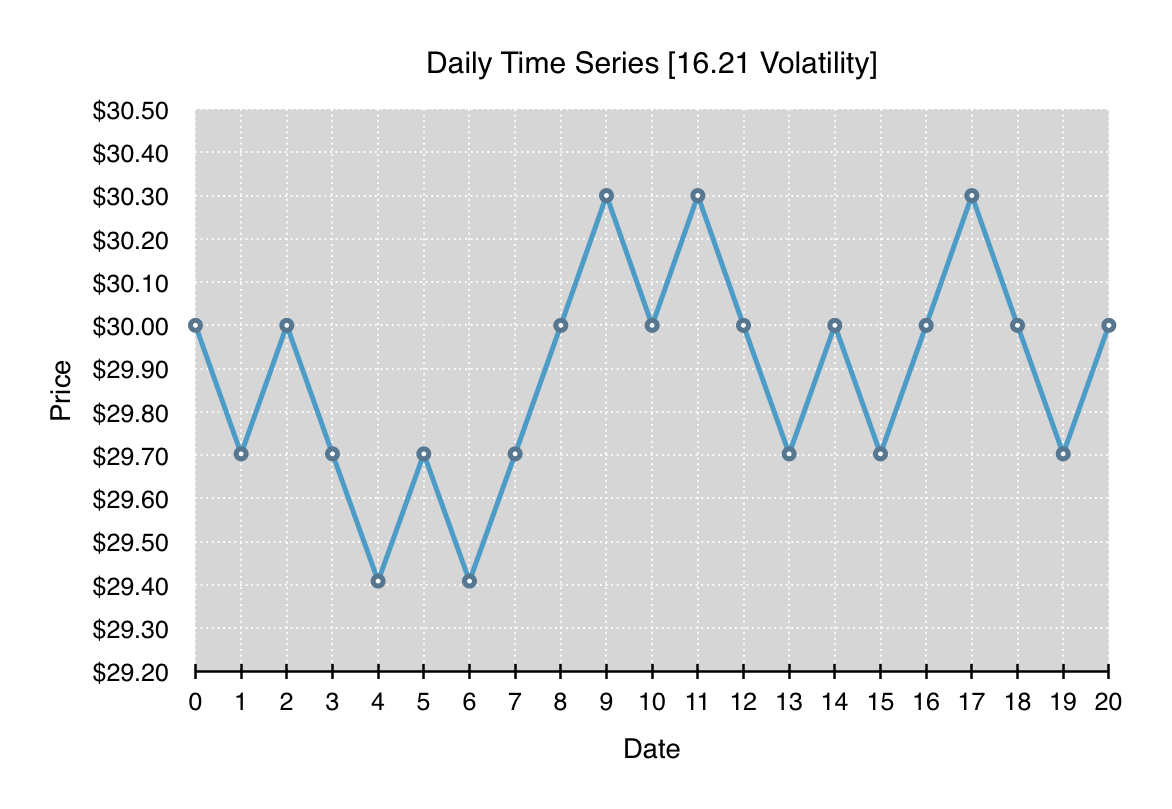
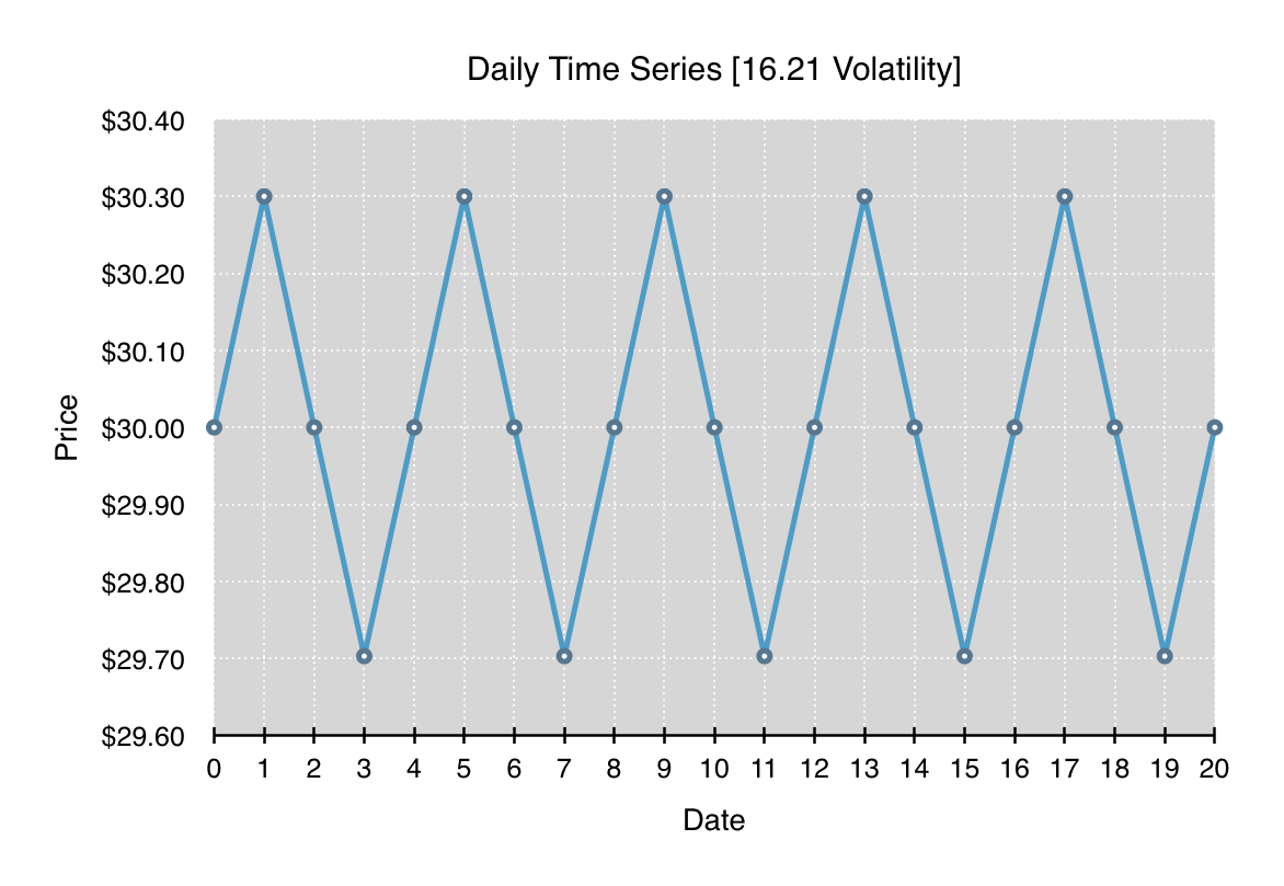
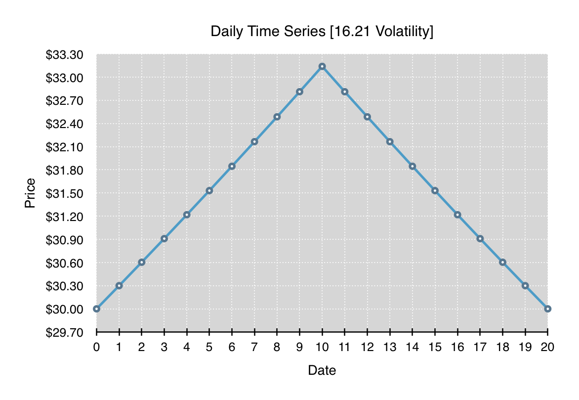
All four of the following charts depict a time series which begins and ends at the same price. Each time series has the same overall annualized volatility of 16.21, and at each time step, the percentage change, either up or down, is the same. What differs significantly between all the charts is the path and range of prices traversed throughout the time series.

Volatility Study 1Volatility Study 2

Volatility Study 3Volatility Study 4

What should be clearly evident from these four time series is that volatility is entirely path independent. Each of the time series can be reordered to form any path as long as the lognormal price changes that make up the time series stay the same. Given a particular volatility, it’s just as likely to have the time series oscillate in a tight band around one price as it is to have the time series break in one direction for an extended run and then return.

The implication for option traders is that, for many option trading strategies, one should not only account for expectations of future volatility, but one should also take into account expectations for path persistence or anti-persistence. As an example, a long gamma position such as a long straddle might forgo delta hedging when traded against an underlying security that tends towards highly persistent paths. Whereas the same position traded against an underlying security that’s more anti-persistent might be far more aggressive in delta hedging any significant moves.

So when formulating option trading strategies, while the forecasting of future volatility is tremendously important, the incorporation of additional metrics that can lend insight into the persistence of future price changes and/or the cumulative price range can be tremendously helpful in the success of the strategy.

Volatility of VIX

The S&P 500 index (SPX) has been down five of the past six trading sessions and along with that has come a significant increase in the VIX implied volatility index. But the most interesting aspect of the selloff is not the current level of the VIX, but the size of the increase and the speed with which it’s taken place, or in other words, the volatility of implied volatility.

VIX [2014]

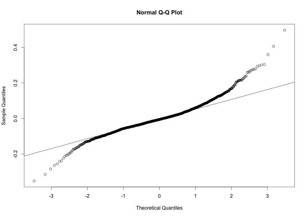
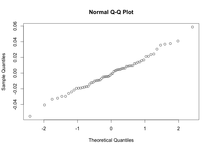
Over the past six days, the VIX has moved from 14.55 to 24.64 and is now 4.033σ above its 50-day SMA. If the daily returns for the VIX followed a normal distribution one would expect a move of this size to happen extremely infrequently. But in fact, the distribution of returns for the VIX varies quite a bit from a normal distribution, exhibiting a positive skewness of 0.7242861 and a fairly significant excess kurtosis of 3.854248. This Q-Q plot quickly shows the deviation of the distribution of VIX returns from the normal distribution. The areas on either end, where it deviates from the diagonal line, depict the long tails associated with excess kurtosis.

VIX Q-Q plot

While still rare to see the VIX over 4σ1 above its 50-day SMA (it has only happened 9 times since 2007), it’s not quite as rare as normally expected. From a qualitative standpoint, this strong move upward in the VIX from rather anemic levels appears to imply a real concern that recent market weakness might translate into a return to higher average levels of market volatility.

DateVIXSMAStandard DeviationScore
2007-06-0717.0613.35200.89582484.139202
2007-07-2724.1715.30642.18141854.063228
2010-05-0632.8018.31802.91215544.972949
2010-05-0740.9518.73504.32338035.138340
2011-03-1629.4018.33322.62523814.215541
2011-08-0431.6619.48003.01225054.043488
2011-08-0848.0020.41685.25584205.248103
2014-07-3116.9511.88701.06457864.755873
2014-10-1324.6414.18082.59344614.032935

Footnote:
1 Chebyshev’s inequality provides a bound on the likelihood of observations greater than 4σ from the mean.

Sell Rosh Hashanah, Buy Yom Kippur?

With yesterday’s 1.6% sell off in the major indices, and the fact that it happened to coincide with the start of Rosh Hashanah, some traders were dredging up the “Sell Rosh Hashanah, Buy Yom Kippur” adage to try to the explain the market action. Like many of these old adages, it’s hard to know whether there’s any quantitive data that actually supports their use. Much of the time, even if these strategies did work at some time in the past, they rarely do today. But there’s no way to know without crunching the data, so that’s what we did.

What was found by analyzing data from the S&P 500 index (SPX) from 1950 to 2013, was that there’s little evidence to justify the strategy of selling Rosh Hashanah and buying Yom Kippur. Over that 64 year period, the mean return for that 9 day period was basically zero. The market didn’t tend to go up or down. It was just a random walk. There was one noticeable outlier in the midst of all this well behaved data, and that was the year 2008. In that one exceptional year, the SPX was down an amazing 17.8% over those nine days. But it was a pretty exceptional year for other reasons as well.

1950 to 2013Excluding 2008
Maximum0.0586860560.0586860556
3rd Quartile0.0100875280.0107616799
Mean-0.003352942-0.0005871179
Median-0.002184052-0.0012134584
1st Quartile-0.016973419-0.0154244534
Minimum-0.177599826-0.0550011089
Std Deviation0.0304814980.0211335060
Skewness-2.7937086220.1961559384
Ex. Kurtosis15.0169742600.3007369142

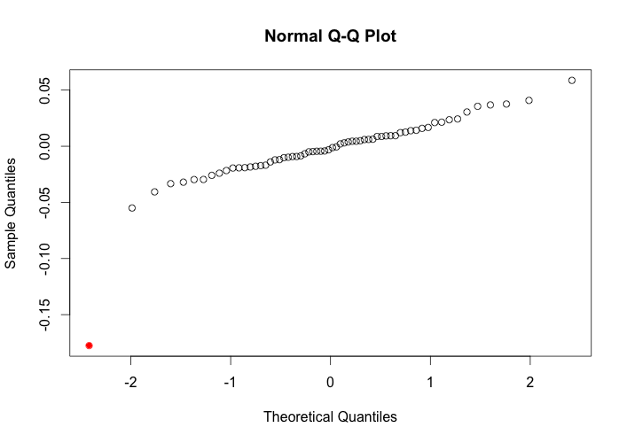
A Q-Q plot is a graphical method for comparing a given set of data to a normal distribution. In the plot on the left below, the majority of the data shows a strong correspondence to the normal distribution. The exception is the data point from 2008 which is highlighted in red in the lower left corner of the plot. In the plot on the right, the outlier from the year 2008 has been removed, better showing how nicely the data corresponds to a normal distribution.

The reason this is important, is that the one data point from 2008 significantly changes the mean, skewness, and kurtosis of the returns. That one datapoint might lead one to believe that the distribution of returns is highly negatively skewed with long tails. However, excluding that one year from the other 63 years, shows a significantly different situation. If fact, the overwhelming majority of data points show the mean, skewness, and kurtosis to be very close to zero, if not slightly positive.

Rosh Hashanah to Yom KippurRosh Hashanah to Yom Kippur

Sell in May? Redux: Another 30 Years

Following on yesterday’s post, I decided to extend our analysis back another 30 years to provide more context to the old adage of “Sell in May and go away”. Again, I’m using historical price data for the S&P 500 index (SPX), but this time with data covering the 30 years from 1964 to 1993.

Comparing the results from this period with results from the most resent 20 years in yesterday’s post, we find that the mean return for the most recent 20 years has actually increased from 0.56% to 1.39%, as well as the median, the 1st quartile, and the 3rd quartile. What has changed most significantly though is the magnitude of the minimum for the most recent 20 years. During the previous 30 years, the worst May to October loss was -18.17%, compared to -30.08% for the most recent 20 years. Just one data point, from May to Oct of 2008 results in the standard deviation, negative skewness and excess kurtosis to be significantly larger for the most recent 20 years compared to the previous 30 years.

So looking at this data with the help of an additional 30 years of data, we see that the more recent trend has actually been for marginally higher returns during the May to October period. While the 18 months of negative returns from November 2007 through April 2009 constitute a very significant market downturn, and can’t simply be cast aside as an outlier, removing just that one data point from the summer of 2008, would lead to the conclusion that there’s even less reason to arbitrarily “sell in May”.

Sell in May